Case study
Fintech identity that earned trust before the first API call.
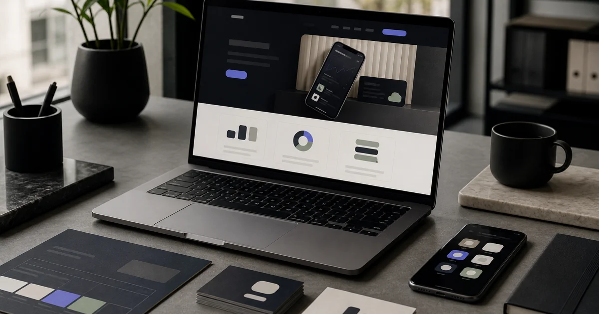
A payments startup was pitching enterprise clients with a generic wordmark and inconsistent UI. Investors and procurement teams equated visual polish with operational maturity. We built a complete identity — logo, color system, typography, UI tokens, and brand book — ready for the website, deck, and developer docs before their Series A roadshow.
6 weeks Concept to delivery
3 Logo directions explored
24 UI tokens defined
2× Demo-to-pilot conversion
Client: Payments infrastructure startup
The challenge
Where they started
Founders had been using a temporary logo from a freelance marketplace. Product UI used three different blues. Sales decks mixed stock icons with screenshots that didn't match the live app. Compliance reviewers flagged marketing pages that looked 'unfinished' compared to established competitors.
- No distinct visual territory in a crowded payments and banking API market
- Product and marketing designed in silos — buttons, spacing, and type didn't match
- Pitch deck branding didn't survive export to PDF or presentation on projectors
- Developer documentation lacked icon and code-block styling standards
- Partners asked for brand assets that didn't exist in organized export formats
Our approach
What we did
01
Positioning workshop
Defined brand attributes — precise, dependable, modern — and competitive white space before any visual exploration.
02
Logo & visual system
Delivered primary mark, app icon, monochrome variants, and a palette tested for accessibility on light and dark UI.
03
UI token package
Specified colors, type scale, spacing, and component states for product and marketing teams in Figma and CSS variables.
04
Launch kit
Shipped brand book, slide templates, social avatars, and a partner asset folder ahead of the fundraising roadshow.
Results
Outcomes that mattered
2×
Demo-to-pilot conversion
Sales attributed improved close rates to cohesive deck, site, and product visual alignment.
6 weeks
Concept to delivery
Full identity package delivered on an accelerated timeline before investor meetings.
24
UI tokens defined
Product and marketing teams shipped features and pages without ad hoc color or type decisions.
Services involved
How we delivered
Logo & Brand Book
Startup identity from positioning through final asset delivery.
Website Design
Brand application on marketing site and product marketing pages.
Client voice
What they said
“City Rentals uses a Travelos-powered digital experience designed to help customers explore car rental services, submit trip requirements, and connect quickly through WhatsApp and mobile booking flows.”
More work
Related case studies
B2B SaaS Landing System
A B2B SaaS marketing team launched one-off landing pages for every campaign, creating inconsistency and slow go-to-marke…
Logistics Visual System
A freight operator with 200+ vehicles still used a 1990s wordmark stretched on trailers and sales one-pagers. RFPs lost …
Flooring Retailer Rebrand
A flooring retailer grew through acquisitions but still operated under four legacy identities — confusing customers and …