Case study
A logistics brand that looked as reliable as the service.
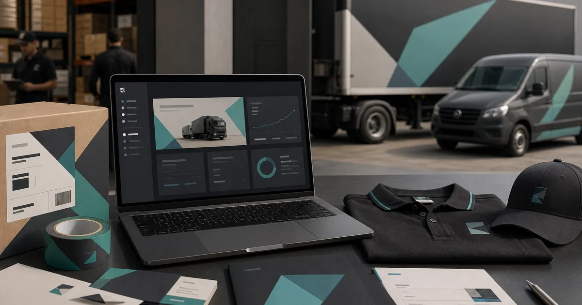
A freight operator with 200+ vehicles still used a 1990s wordmark stretched on trailers and sales one-pagers. RFPs lost on perception before price was discussed. We modernized the visual system — refined logo, fleet livery rules, uniform standards, and a brand book ops teams could actually follow in the yard and on the road.
200+ Vehicles re-livery
36-page Ops-focused brand book
+22% Careers page applications
8 Depot signage templates
Client: National freight and warehousing operator
The challenge
Where they started
Drivers and warehouse staff applied logos inconsistently on uniforms and dock signage. Sales proposals used clip art and competitor color schemes. The careers site looked nothing like customer-facing materials, hurting driver recruitment in a tight labor market.
- Legacy logo illegible at distance on trailers and high-visibility vests
- No standards for uniform embroidery, hard-hat stickers, or pallet wrap branding
- Sales team built proposals in PowerPoint with outdated master slides
- Safety and compliance documentation used a different header style than marketing
- Recruiting ads on job boards didn't match the corporate website aesthetic
Our approach
What we did
01
Field audit
Photographed fleet, depots, uniforms, and sales collateral to catalog real-world application gaps.
02
Mark refinement
Simplified the logo for small sizes and high-contrast applications — embroidery, vinyl wrap, and favicon.
03
Application standards
Specified livery layouts, PPE branding zones, depot signage grids, and proposal cover templates.
04
Rollout & training
Partnered with fleet graphics vendor on phasing and trained regional managers on brand compliance checks.
Results
Outcomes that mattered
200+
Vehicles re-livery
Phased trailer and cab rebranding completed across major routes without service disruption.
+22%
Careers applications
Aligned recruiting creative and careers site design improved driver and warehouse applicant volume.
36-page
Ops brand book
Practical guidelines for yard signage, uniforms, and vehicle graphics — not just marketing theory.
Services involved
How we delivered
Logo & Brand Book
Visual identity systems for operational and customer-facing teams.
Website Design
Brand application across customer portal marketing and careers pages.
More work
Related case studies
Flooring Retailer Rebrand
A flooring retailer grew through acquisitions but still operated under four legacy identities — confusing customers and …
B2B LinkedIn Carousels
A B2B software vendor was posting static product screenshots that earned likes from employees but never reached procurem…
Hospitality Brand Refresh
A resort collection had grown to five properties, each with its own Instagram aesthetic and printed menu style. Guests d…