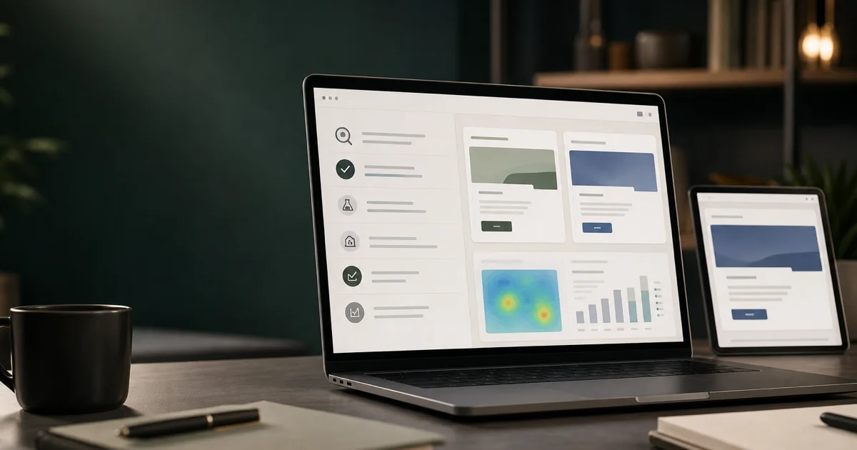
A logo is only the entry point. Your brand is what people remember after they click an ad, skim a proposal, open a support email, or scroll past your social post. When those moments feel unrelated, trust thins out. When they feel intentional and consistent, recognition builds faster and sales conversations start warmer.
Most service businesses invest in a logo and website, then let every other channel drift. Marketing uses one shade of blue. Sales uses an outdated PowerPoint template. Social media posts look nothing like the homepage. The result is a brand that exists on paper but not in the market.
This guide covers how to define, document, and deploy brand identity across digital touchpoints — so your team and partners produce consistent work without reviewing every asset manually.
What brand identity includes beyond the logo
A logo is a symbol. Brand identity is a system. At minimum, a usable digital brand identity includes:
Visual foundations
- Logo system — Primary logo, secondary marks, favicon, social avatars, clear space and minimum size rules
- Color palette — Primary, secondary, and accent colors with hex, RGB, and CMYK values
- Typography — Heading and body font families, weights, size scale, line height
- Imagery style — Photography treatment, illustration style, icon set, what to avoid
- Layout principles — Grid, spacing scale, border radius, shadow usage
Voice and messaging
- Brand voice — Tone attributes: confident but not arrogant, technical but accessible
- Messaging hierarchy — Tagline, value proposition, elevator pitch, boilerplate
- Audience-specific messaging — How positioning shifts by persona or vertical without contradicting core identity
- Words to use and avoid — Industry jargon, competitor references, superlatives without proof
Application standards
- Digital templates — Social post dimensions, email header, presentation cover, document headers
- UI components — Button styles, form fields, card patterns for web and product
- Co-branding rules — How your brand appears alongside partners or clients
Without documentation, consistency depends on memory. That fails the moment you hire, outsource, or scale.
Why digital touchpoint consistency matters
Buyers encounter your brand across an average of six to eight touchpoints before they convert — often more in B2B. Each touchpoint is a trust signal.
Recognition reduces cognitive load
When your LinkedIn ad, landing page, and follow-up email look and sound like the same company, visitors do not re-evaluate credibility at every step. Recognition is shorthand for “I have seen this before; it is legitimate.” Inconsistent touchpoints force buyers to wonder if they are dealing with the same organization — or a scam.
Consistency signals professionalism
A polished, coherent brand signals operational competence. If your marketing materials look thrown together, buyers assume your service delivery might be too. This is especially true for high-consideration services where the website is the primary sales tool.
Efficiency for internal teams
Documented brand identity lets marketing, sales, and external partners produce assets without bottlenecking on creative review. Designers spend time on strategy, not fixing off-brand PDFs.
Mapping your digital touchpoints
Before you can align touchpoints, inventory them. Most companies have more than they realize.
Owned touchpoints
- Website — homepage, service pages, blog, landing pages
- Email — newsletters, nurture sequences, transactional messages, signatures
- Social profiles — LinkedIn, Instagram, X, YouTube channel art and post templates
- Paid ads — search, display, social, retargeting creative
- Sales collateral — proposals, case studies, one-pagers, pitch decks
- Product or client portal — if applicable
Earned and shared touchpoints
- Guest articles and contributed content
- Podcast appearances and webinar slides
- Partner co-marketing materials
- Client-facing deliverables that carry your brand
The touchpoint audit
For each touchpoint, score consistency 1–5 against your current brand standards:
- Visual alignment — colors, fonts, logo usage
- Voice alignment — tone, messaging, terminology
- Quality bar — resolution, layout, mobile rendering
Low scores reveal priority fixes. A landing page scoring 2/5 on visual alignment while receiving paid traffic is urgent. An outdated email signature is annoying but lower priority.
Building the brand book for digital
A brand book — or brand guidelines document — is the single source of truth. For digital-first businesses, it must go beyond print-era specs.
Structure we recommend
- Brand story and positioning — Why you exist, who you serve, what you stand for
- Logo usage — Correct applications, misuse examples, file formats (SVG, PNG, dark/light backgrounds)
- Color system — Palette with accessibility notes (contrast ratios for text on backgrounds)
- Typography — Web font loading, fallback stacks, size scale for headings and body
- Imagery and iconography — Style guide with do/do not examples
- Voice and tone — With sample copy for common scenarios: homepage, ad, email, error message
- Digital templates — Figma, Canva, or PowerPoint files for recurring asset types
- Web components — Button, card, form, and navigation specs for developers
Accessibility as a brand standard
Color contrast, readable font sizes, and alt text are brand decisions, not afterthoughts. Document minimum contrast ratios. Specify focus states for interactive elements. A brand that excludes users with visual impairments is not a professional brand.
Version control
Brand books go stale. Assign an owner. Review quarterly. Version the document — “Brand Guidelines v2.1, August 2026” — so teams know which specs are current.
Website as the brand anchor
Your website is typically the highest-traffic owned touchpoint. It should be the reference implementation of your brand identity — not an exception to it.
Design system on the web
Translate brand book specs into a web design system:
- CSS custom properties for colors, spacing, and typography
- Component library for buttons, cards, forms, and navigation
- Responsive breakpoints with documented behavior
- Image aspect ratios and treatment rules
When landing pages, blog templates, and service pages pull from the same system, new pages launch on-brand by default.
Common website brand failures
- Stock photo inconsistency — Every page uses a different photographic style
- Font drift — Marketing adds a trendy font for one campaign; it never gets removed
- Color approximation — “#3B82F6” on the homepage, “#4285F4” on landing pages
- Logo misuse — Stretched, low-resolution, or wrong variant on subpages
- Voice whiplash — Homepage is confident and direct; blog reads like a textbook
Audit your site against the brand book. Fix the highest-traffic pages first.
Paid advertising and landing pages
Ads are often the first brand touchpoint. They must feel like the website visitors land on — instantly.
Creative consistency
- Ad visuals use brand colors, fonts, and imagery style
- Ad copy matches voice guidelines — not a different persona
- Logo placement follows clear space rules even at small sizes
- Landing page headline echoes ad promise (message match is a brand issue, not just a CRO tactic)
Template approach
Build ad creative templates in approved dimensions for each platform: Google responsive display, LinkedIn single image, Meta feed. Templates enforce consistency and speed production.
Retargeting as brand reinforcement
Retargeting ads that look like your website remind visitors where they were. Retargeting ads that look like a different company waste impressions and confuse.
Social media and content
Social moves fast. Without templates and voice guidelines, every post becomes a one-off design exercise.
Profile consistency
- Profile and banner images use current logo and brand colors
- Bio copy uses approved messaging hierarchy
- Link destinations land on on-brand pages
Post templates
Create templates for recurring formats: thought leadership quote cards, case study highlights, event promotions, team spotlights. Templates do not mean boring — they mean recognizable.
Voice on social
Social voice can be slightly more conversational than your website, but it should feel like the same company. Document the delta: “We use contractions on LinkedIn but not in proposals.” Ambiguity produces inconsistency.
Email and nurture sequences
Email is intimate — it arrives in a personal inbox. Off-brand email feels like spam even from a known sender.
Standards to document
- Header and footer design with logo, address, unsubscribe
- Typography that renders across clients — web-safe fallbacks where needed
- Button styles matching website CTAs
- Signature format for all team members
- Tone for transactional versus marketing versus sales outreach
Sequence coherence
A nurture sequence should feel like one conversation, not five disconnected emails from five different brands. Same voice, same visual system, escalating value.
Sales collateral alignment
Marketing builds the brand. Sales delivers it in proposals and decks. Misalignment here damages deals.
The sales enablement gap
Common problems:
- Sales uses a deck from two years ago with old positioning
- Proposals are Word documents with manual formatting
- Case studies exist on the website but not in a sales-ready format
- Pricing pages and proposal language contradict each other
Fix with templates and libraries
- Presentation template in brand system, updated centrally
- Proposal template with locked brand elements and flexible content sections
- Case study one-pagers pulled from the same source as website content
- A shared drive or DAM with “approved assets only” — no digging through old folders
Sales should spend time selling, not reformatting slides.
Governance: keeping consistency as you scale
Documentation without governance decays. Assign responsibility.
Roles
- Brand owner — Usually marketing lead. Approves changes to guidelines, owns the brand book.
- Template maintainers — Update Figma, Canva, or slide templates when specs change.
- Review cadence — Quarterly touchpoint audit. Annual brand book review.
Onboarding
New hires and agency partners receive brand guidelines on day one. Include a 15-minute walkthrough, not just a PDF link in a welcome email.
Exception process
Sometimes a campaign needs to bend the rules — a co-branded event, a vertical-specific landing page. Define how exceptions are requested and approved. Undocumented exceptions become new standards, and standards erode.
Measuring brand consistency impact
Brand work is harder to measure than PPC, but proxies exist.
Indicators to track
- Brand search volume — Increases in searches for your company name suggest growing recognition
- Direct traffic growth — Return visitors who type your URL
- Conversion rate by touchpoint — Do on-brand landing pages outperform off-brand ones?
- Sales cycle feedback — Ask reps whether prospects mention your materials positively or confuse you with competitors
- Asset usage — Are teams using templates or creating one-offs?
Before and after
If you are rebuilding brand identity, capture baseline metrics before rollout. Measure again at 90 and 180 days. Consistency improvements often show in conversion rate and sales velocity before they show in brand surveys.
When to invest in a brand refresh
Consistency work is not always a full rebrand. Consider a refresh when:
- Your positioning has shifted but visuals have not
- Mergers or new service lines outpace current guidelines
- Website, ads, and collateral visibly clash
- You are entering new markets or verticals that need tailored messaging within a coherent system
A refresh can be evolutionary — updated palette, refined typography, clarified voice — without throwing away recognition you have built.
Brand identity across digital touchpoints is not a design exercise. It is a revenue exercise. Every consistent interaction builds trust. Every inconsistent one creates friction. Service businesses that document, deploy, and govern their brand identity produce marketing and sales materials faster, convert more visitors, and look like the established players they are competing against.
Ready to align your brand across every digital touchpoint? Explore our logo and brand book services or see our website design work. Contact Krivon to discuss your brand system.